
Quick Browser Window Resizer
Overview
The Quick Browser Window Resizer is a lightweight browser extension designed to streamline the process of resizing browser windows to predefined or custom dimensions. Its primary purpose is to assist developers, designers, and testers in quickly simulating various screen sizes—ranging from mobile devices to desktop layouts—without manual adjustments. This tool solves the common challenge of inconsistent testing environments by offering an instant, repeatable method to switch between viewport sizes. The extension is particularly useful during responsive web development, UI/UX testing, and cross-browser compatibility checks.
Target users include front-end developers, web designers, quality assurance testers, and anyone involved in web content creation. The tool’s open-source nature, developed by the 1ce team, emphasizes transparency and community-driven improvement. While the developer background is limited to the project’s public identity, the commitment to open-source principles suggests a focus on accessibility and security. Real-world usage scenarios include rapid iteration during design reviews, validating layout responsiveness, and preparing content for deployment across multiple devices.
Key Features & Capabilities
- Predefined Screen Sizes: Offers a built-in list of common device dimensions, including mobile, tablet, and desktop resolutions, enabling quick selection for testing.
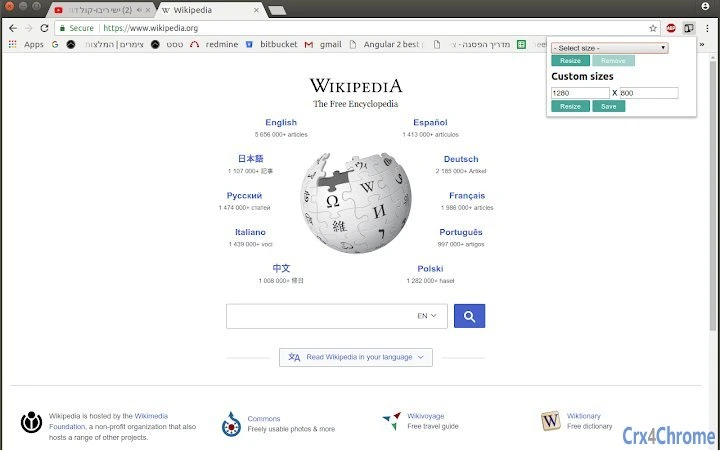
- Custom Size Creation: Allows users to define and save custom window dimensions by entering width and optional height values directly in the interface.
- One-Click Resizing: Simplifies the workflow by applying selected dimensions with a single click, reducing manual effort and minimizing errors.
- Save & Manage Custom Sizes: Users can persist custom configurations for future use, improving efficiency across multiple projects.
- Remove Custom Entries: Provides the ability to delete unwanted custom sizes from the list, maintaining a clean and organized workspace.
- Open-Source Transparency: The extension’s source code is publicly available, allowing users to audit, verify, or contribute to its development.
These features are especially valuable during rapid prototyping or when conducting repetitive testing across multiple devices. For example, a developer can test a layout on a mobile screen, then instantly switch to a 1920x1080 desktop view, all within seconds. The ability to save custom sizes ensures consistent testing across teams and projects, reducing setup time and enhancing workflow consistency.
User Interface, Workflow & Performance
The user interface is minimal and focused, centered around a clean icon-based panel that appears upon clicking the extension. The layout includes a dropdown list of predefined sizes, input fields for custom width and height, and action buttons for resizing, saving, and removing entries. Navigation is intuitive, requiring no learning curve for users familiar with browser extensions.
Workflow efficiency is high, with each resizing action completed in under three clicks. The extension operates entirely within the browser context, ensuring low latency and immediate visual feedback. The developer did not specify resource usage details, but based on its size (1.2 MB) and functionality, it is expected to have minimal impact on system performance. Stability is presumed to be strong due to the absence of external dependencies and data collection. No permissions are required, which contributes to a secure and lightweight experience.
Compatibility & System Requirements
The extension is compatible with Chrome, Edge, and Firefox browsers, making it accessible across major desktop platforms. The software version is 1.0.0, released on May 15, 2024. The installation size is 1.2 MB, which is relatively small and efficient for a browser extension. Exact system requirements were not listed, but given its nature as a browser-based tool, it is expected to function on any modern system supporting the listed browsers.
Platform compatibility information is limited to the supported browsers. No specific hardware requirements were provided. Users can expect consistent behavior across devices as long as the target browser is up to date. The extension does not rely on external services or APIs, ensuring reliable performance regardless of internet connectivity.
Pros and Cons
Pros
- Lightweight and fast, with a small file size of 1.2 MB.
- Open-source, allowing transparency and community contributions.
- Zero permissions required—enhances privacy and security.
- Supports both predefined and custom viewport sizes.
- Simple, intuitive interface with minimal learning curve.
- No data collection—user privacy is preserved.
Cons
- Only available as a browser extension, not a standalone desktop application.
- Limited to desktop browsers; no mobile support.
- Custom size management lacks advanced features like categorization or tagging.
- Exact performance metrics were not provided.
FAQ Section
Is the extension safe to use?
Yes. The extension is open-source, meaning the code is publicly available for inspection. No data is collected or transmitted, and it operates entirely within the user’s browser.
Can I use this on multiple browsers?
Yes. The extension is compatible with Chrome, Edge, and Firefox, allowing users to install it across different browsers.
Does it require any permissions?
No. The extension does not request any permissions, ensuring it does not access sensitive browser data.
Is there a desktop version available?
No. This is a browser extension and is not distributed as a standalone desktop application.
How do I update the extension?
Updates are automatically managed by the browser’s extension store. When a new version is released, the browser will prompt the user to update.
Final Thoughts + CTA
The Quick Browser Window Resizer delivers a focused, efficient solution for developers and designers who need to test responsive layouts across various screen sizes. Its open-source foundation, privacy-first design, and straightforward workflow make it a trustworthy addition to any web development toolkit. While it is limited to browser-based use, its simplicity, speed, and transparency outweigh these constraints for its intended audience.
For front-end developers, UI testers, and design teams working on responsive projects, this tool offers a reliable and secure way to simulate device views. Its ability to save custom sizes and operate without permissions enhances productivity without compromising security.
Download Quick Browser Window Resizer now.